


“I am a believer that colour affects people’s mood.”
-Lilly Pulitzer, Designer
Psychologists have proven it long back that the colours affect our mood/ attitude/ behaviour. What we see and how we perceive it can be influenced by the colours of it. To make it much more simplified think of it in a way that when you are on a beach and you are watching a sunrise; how would you feel? Calm, composed, motivated and enthusiastic for a new beginning, all those emotions that you feel are influenced by the symbolic meaning of colours that you have understood starting from the childhood studies you had. You know that the yellow/orange colour of the sun means motivation, energy and enthusiasm and mixed with that is the calmness of the blue serene ocean. The same works everywhere including the digital world by which mean our User Interface as well. UI designers have to perform a complete study on colour theory before the design a UI for any website or application.
What does Colour Theory say?

All the designers are well aware of the colour wheel and its working but here is a quick recap to the same and all the shades that come along with it:
-
Hue: These are the colours in their natural state by which it means that they are used without any filter or light. These are presented in the outermost circle of the colour wheel.
- Value: These colours incorporate the amount of light in it. For example how the shades of the colour change when a certain amount of light is shed upon them. For example, trees appear darker at night time as compared to when the daylight is shed onto them.
- Saturation: This refers to the intensity of the colour. For example, the intensity varies when you design for digital or printing purpose. The intensity lies between 0-100%, 0 being the lightest usually white and 100 being the darkest tone of that colour.
Colours in UI Design
Colour Ratio
The most effective website and app colour scheme will follow a 60-30-10 ratio. It's too easy to use- 60% is your dominant hue, 30% is your secondary colour and 10% is for an accent colour. Remember to keep the accent colour as the most vibrant colour as it will be used for most critical items like Call to action elements. You can keep the main colour as the neural one and secondary to be in its contrast.
Shadow in UI

Shadows provide clues about depth, the direction of movement, and surface edges. Never keep a shadow of black colour; this is the most common mistake that we often do while creating shadows. Take an example from your surrounding especially from semi-transparent materials. Their shadows have always inherited the colour of the object.
Colour in Typography
Typography is the most important element of any UI Design and so improving it is an important part of improving UI and UX as well. Talking about colour in UI Design, always try to keep the colour of the body on a bit Darker grey shade rather than black. The reason for this is that the impact of contrast on screens is more severe than that on paper and so it’s quite tiring to read the text with black shade.
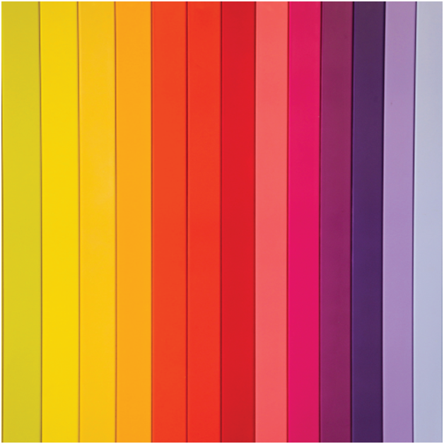
The psychology behind using the following colours:
-
Red: Use this colour when you want to highlight or derive the attention of the user/viewer.
-
Yellow: Colour of happiness, sunlight and warmth; optimise this colour more in graphics to highlight inspiration and motivation.
-
Blue: Use this shade to highlight more professional relationships and especially to build trust for your brand among your clients
-
Green: Nature is the ultimate symbol of the shade green and use this colour to highlight graphics or UI designs that are associated with nature; this may include websites or applications for food and travel industry.
-
Orange: The colour of energy, enthusiasm and spirituality. Designers can definitely use this colour to cast a shadow on graphics/products that symbolises the above-given characteristics.
-
Purple: The colour of royalty, mystery and magic. This colour can definitely be leveraged to highlight the luxury of the advertising element.
Lastly, some tips to use the colour palette in your UI/UX Design
-
Maintain harmony among the colours.
-
Don’t forget that some colour symbols may vary depending upon the different region or culture.
-
Think of contrast as your biggest friend.
-
And, carefully study the psychology of the colours that influence your UI/UX Design.


