


Imagine! A senior executive comes to your office, gives you all the information and facts that you want to know about. You are very interested in purchasing the product, but then he gets up and walks out without saying anything. How would you react? He did not give you any information for purchasing the product or guide you on what action to take next.
That’s exactly why a call to action button is important in a website.
What is a call to action (CTA) Button?
A call to action (CTA) button is a prompt on a website that informs the user to take some specified action. A call to action is usually written as a command or action phrase, such as ‘Sign Up’ or ‘Buy Now’ and normally takes the form of a button or hyperlink.
Importance of a call to action (CTA) button
The call to action is a key component on a webpage, acting as a signpost that allows the user to know what action to take next. Without a clear CTA button, the user may not know the next steps to complete the desired tasks on a particular website.
A call to action button makes it clear to potential customers which action to take next and also helps remove any discord in moving the user to make the final purchase. There can be multiple calls to action on a page if there are multiple desired actions for the user to take.
For instance, if a reader lands on a blog article and there is no clear call to action button at the bottom of the post, the reader will likely leave the site without completing any other tasks. Though, if there is a CTA button at the bottom of the post asking them to read more articles or to sign-up for an e-mail newsletter, then that can encourage the user to continue interacting with the site.
How to Create the PERFECT call to action (CTA) button?
Marketers hire several strategies for creating effective CTA buttons. Beneath is a list of some common ones:
Good Design
The best call to action button need to grab the user's attention, hence a bright button color that contrasts with the color of the page or an email will be an effective strategy to go ahead with.
High Visibility
Since the call to action should be the most noticeable thing on the page, the font size should be large enough to dominate attention.
Clear Benefit
Maintaining a clear benefit that the user will get from completing the transaction is an effective way to get them to click.

Actionable Text
A call to action, is designed in a way to compel the user to take action, so an effective CTA button must use action words such as "discover", "learn more", and "buy now".
Short in Length
A good call to action should be a short phrase and not a sentence. Most call-to-action buttons are no longer than five to seven words.
Sense of Urgency
Users are easily amused on the internet, therefore a strong sense of urgency like a limited time offer can help induce users to act immediately instead of putting off acting.
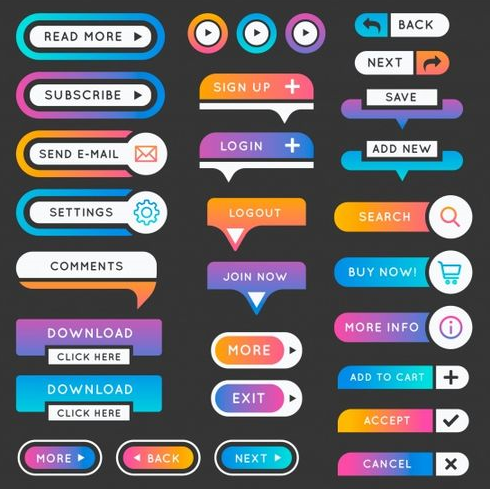
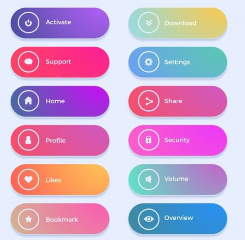
Types of Call to Action (CTA) Buttons
A call to action can refer to any ask or request that you want your user to follow on the site, so a CTA button can take many forms depending on the context. A call to action can vary from being a closing statement in a blog post, a line in an email to a CTA button on a website.
Here are some call to action examples one might typically see on a blog post:
Read more articles
Sign-up for our newsletter

Support our sponsor
Share on social media
For a B2B company, call to action text could be:
Get started
Sign up

Free Trial
Contact Sales
An efficient call to action communicates what the user can anticipate when they click on a button or take the next action, which can improve the click-through rate. Whereas on an eCommerce site, the CTA button may be extra commercially focused:
Add to cart
Checkout
Buy now
Add to Wishlist
In every case, the CTA button on the page asks the user what action to take next in order to continue interacting with the site and moving further down the conversion funnel of being a user to a client.

